Project Overview
The Analytics and Innovation Unit at Toronto Police Services (TPS) is responsible for analyzing and reporting on service-wide crime trends and patterns, providing crime and operational reports to Command Officers on a regular basis, as well as presenting reports and recommendations pertaining to crime and business intelligence strategies.
This project focuses on designing an expeirence for a concerned member of the public who has limited technical data analytics capabilities but who wants to be informed of criminal and police activity, especially in their neighbourhood. In this case study, the focus lies on revamping the homepage experience of TPS's Public Safety Data Portal (PSDP) and also conceptualizing ideas for a real-time dashboard that lets users review live data on criminal and police activity in Toronto's various neighbourhoods.
This project focuses on designing an expeirence for a concerned member of the public who has limited technical data analytics capabilities but who wants to be informed of criminal and police activity, especially in their neighbourhood. In this case study, the focus lies on revamping the homepage experience of TPS's Public Safety Data Portal (PSDP) and also conceptualizing ideas for a real-time dashboard that lets users review live data on criminal and police activity in Toronto's various neighbourhoods.

|
Goal -
|
My role - Conduct preliminary research, create sketches and wireframes to brainstorm new ideas, present research findings and create high-fidelity prototypes for given scenarios
Tools used - Axure, Figma, Canva
Tools used - Axure, Figma, Canva
Research - Understanding the Users
I began by trying to better understand how members of the general public in Toronto might currently be using the website. I spoke with 6 people in Downtown Toronto to gather insights about awareness, relevance and usage of Toronto Police Services' Public Safety Data Portal. The goal was to gather qualitative data to inform next steps in the design process.
From all the people I interacted with, most of them did not know that a website existed where they could learn about crime and police activity in and around the city.
After showing them the website and having them explore the home screen briefly, I learnt that users found it difficult to understand some of the terminology used. It was also not obvious for them where to find the actual data reports that they intended to find.

Participants were not photographed to respect their privacy
(Source: www.blogto.com)
|
"Wow! Does something like that exist today or is it an app that might come out in the future?"
"Hmmm... Looks like there's some report I should look at. What does this (MCI) mean? Is this an error (alignment of text and background)?" "Okay this is confusing. How are all these reports different? Like I know they for different crimes but what's the source? Confused! I might just call them - where's that?" "I won't spend time looking at this on my computer, unless it concerns me." "So this is from 6 months ago. What use is that? Can I see for my area in North York? Can I go into my street?" "Oh! I am meant to download the report. Am I right?" |
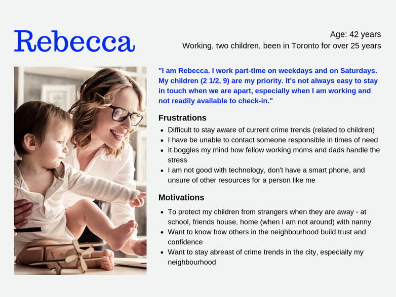
Based on the interviews conducted, I decided to create a persona to better represent the user goals, pain points and expectations from the portal. There were a variety of opinions shared by the interviewees which could be captured into one persona. In a multi-cultural and populated city like Toronto, there are bound to be more user groups that would make use of criminal and policing trend data.
For the first round, the goal was to focus on someone who isn't tech-savvy, wants to be well-informed and have ready contact available to reach out to.
Research - Website Usability Analysis of Current Experience
After defining the project goal and understanding the target users, I did an analysis (expert review) of the target application. This process gave an opportunity to learn and understand the application better.
When I performed heuristic evaluation on TPS Public Safety Data Portal's home page experience, I observed many usability problems. Many of which, were in need of immediate attention to be usable by not just target users who are not tech-savvy, but others as well.
Detailed heuristic analysis report can be found here.
The main issues focused on were -
- Data accessibility
- Inconsistent visual hierarchy
- Alignment of design elements
- Navigation and menu hierarchy
- Awareness for vision impaired users
- Relevance of design standards
Experience Map
|
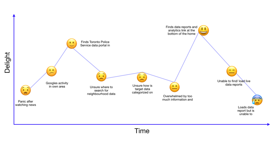
Going back to the persona - Rebecca
As the primary goal is to help Rebecca overcome her challenges and obstacles. I created a visualization/ journey map to better outline the problems I was looking to find a design solution for. While it is important to note the low points, it is equally important to keep track of the high points in the experience to be maintained for future considerations. |
|
Turning Challenges into Opportunities
Challenge - Users are unsure where and how to search for relevant data on the home page
Suggested action - Prioritize users' primary actions in the experience to give them easy and straightforward access to relevant data
Challenge - Users do not know how to differentiate between the given data reports and design elements, making it tougher and more time-consuming to locate information
Suggested action - Provide help at every touch point of the experience, in the form of corrected information hierarchy and necessary guidance steps
Challenge - Users are overwhelmed by the amount of similar options
Suggested action - Provide users with options to filter through all the data reports and find the right information
Challenge - In certain situations, it is not useful to find data reports from 6 months ago
Suggested action - This is not a straightforward solution. However, given instructions and constraints from project overview conveyed that TPS has been looking to load live data instead of online and downloadable reports
Challenge (Additional) - Users with impaired vision have trouble reading given text with ease
Suggested action - Take accessibility design principles in consideration to be inclusive
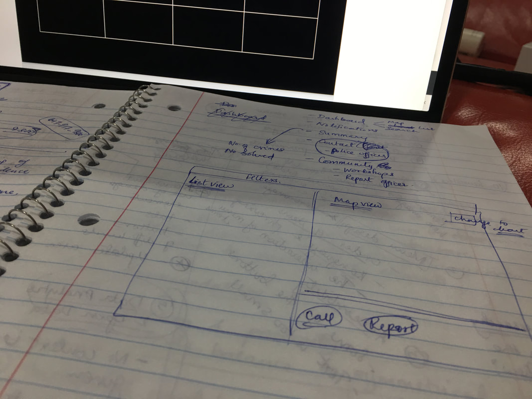
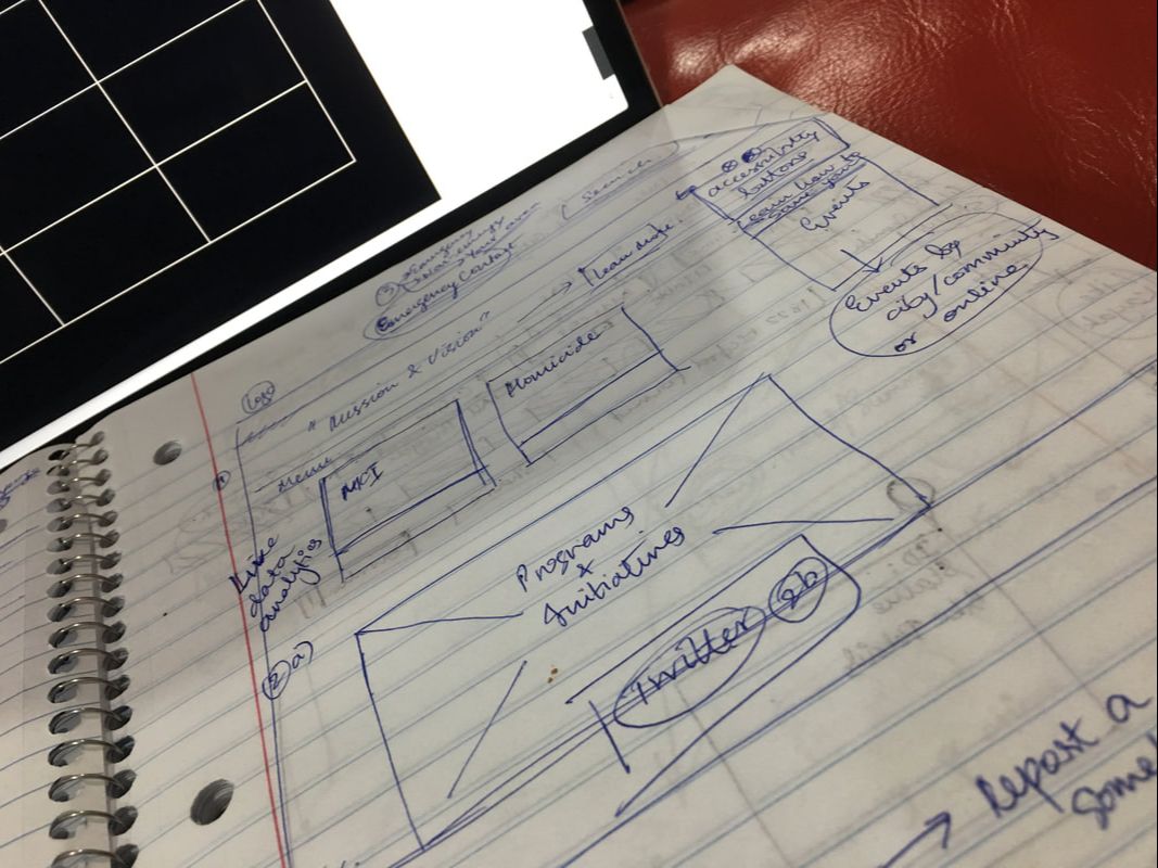
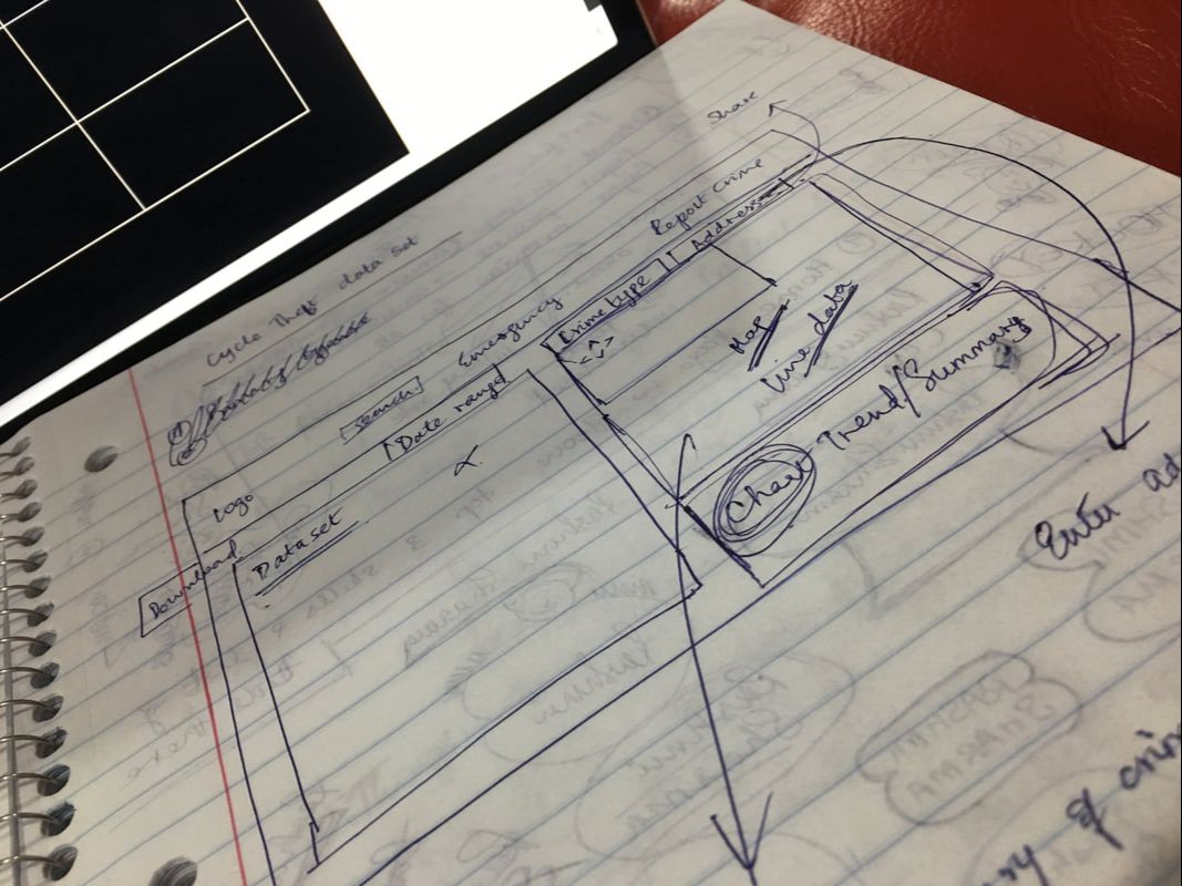
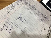
Design Solutions - Continued Brainstorming & Sketching
No design solution is created overnight. It involves a lot of failed attempts to create something that fulfils user goals, is usable and visually appealing.
|
|
|
|
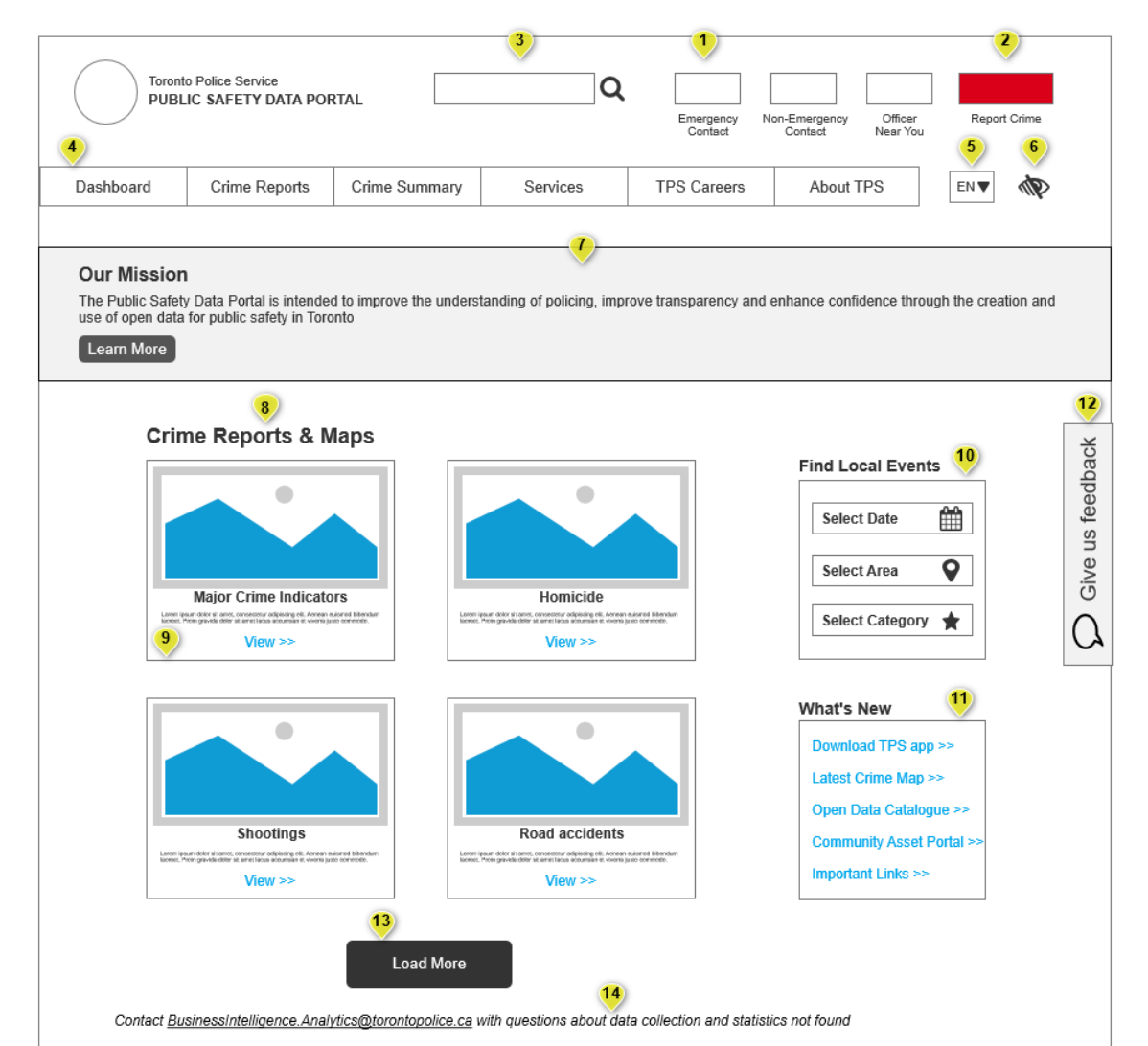
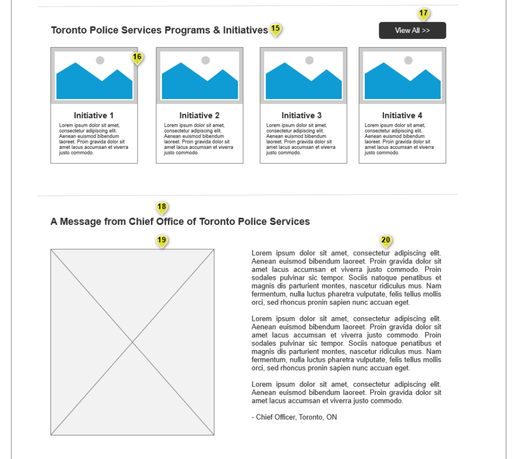
Design Solutions - Wireframing
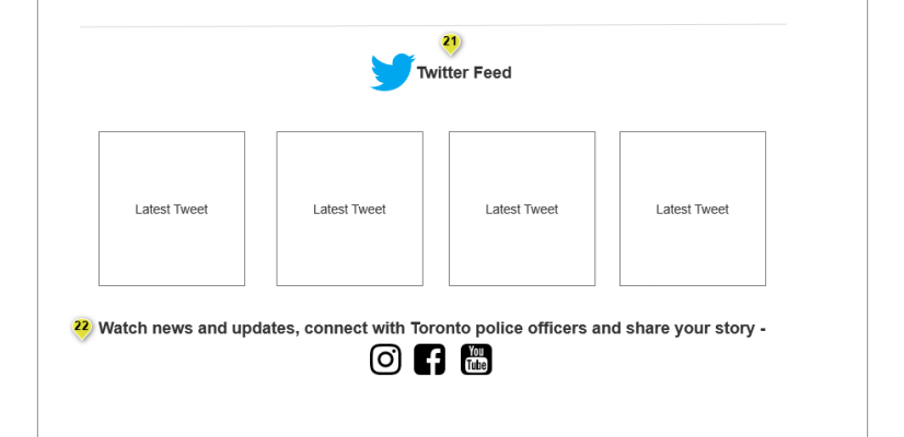
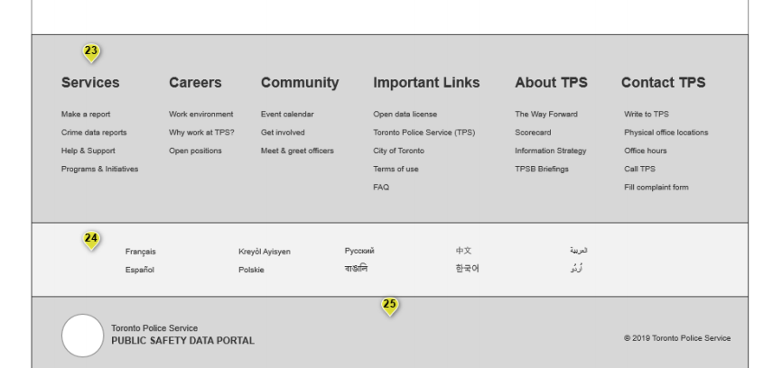
Below are annotated wireframes with detailed notes created of the homepage experience using Axure.
View full wireframe here - https://elrl6n.axshare.com/
View full wireframe here - https://elrl6n.axshare.com/
|
|
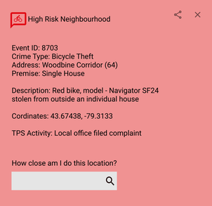
Below is the wireframe of the suggested dashboard experience that provides users with live data reports and interactive visualization options.
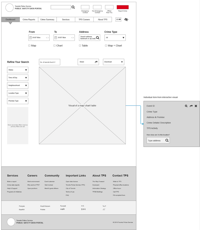
Final Product
After the wireframes were submitted, it was time to continue designing a new dashboard to display live criminal and police data using a variety of design and data elements. This is an interactive visualization of data that lets users easily filter through data - locality, dates, crime type etc - and clearly synthesized data that users can understand and digest easily.
The prototype was created using Figma.
The prototype was created using Figma.

|
|
Future Considerations
Future development would include personalized notifications and alerts helping users have options to be readily informed. As this was out of scope for the current project I did not incorporate it in the designing and testing process.
Additionally, using all the learnings from this initiative, I will experiment with responsive design to create mobile screens and test with users to evaluate the mobile experience. Minimal design and mobile-first would be the goals of the upcoming steps.
Additionally, using all the learnings from this initiative, I will experiment with responsive design to create mobile screens and test with users to evaluate the mobile experience. Minimal design and mobile-first would be the goals of the upcoming steps.
