TJ Check - You are what you eat
|
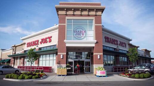
Trader Joe's is a neighborhood grocery store in the United States of Amercia, with a range of food and drink items, that are usually not found in other regular stores like QFC, SafeWay and Target etc.
This initiative of creating a digital experience for a unique grocery store was executed in association with the customer service at one of the Trader Joe's in Seattle, Washington and the University of Washington |
Problem Statement
As part of their sales strategy, certain grocery stores introduce unconventional items that are not easily available in nearby stores, in order to increase their customer count. Customers typically visit such stores with expectations to find specific and special items there. However, a supermarket that is smaller than most of those within and around the vicinity, tends to limit a consumer’s shopping experience. This limitation is in terms of the unavailability of items due to shortage in stock or availability of various other items that might not be on a user's grocery list. When people visit such a store, they face the issue of not finding their choicest items/ articles in stock. How can a customer gain knowledge about supplies present at the store?
My role: Ethnographic user research, wireframing, prototyping (low- and high-fidelity), usability testing
Tools used: Envision cards, Axure
Tools used: Envision cards, Axure
Research - Contextual Inquiry
|
This first thing I did was talk to users of Trader Joe's. My team of two other designers and I visited the nearest TJ store and conducted contextual interviews to get an idea about their experience - goals and pain points. I spoke with close to 10 Trader Joe's customers in the University District of Seattle, Washington.
Some of the questions asked -
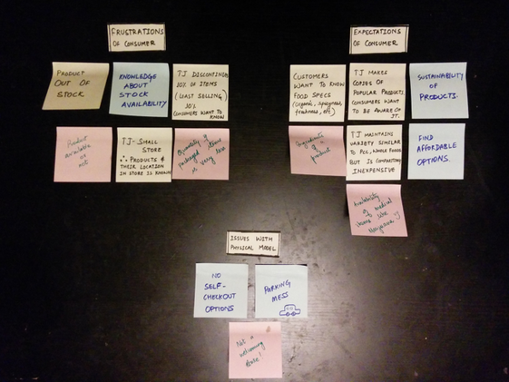
The results of these interviews helped us determine customer pain points, shopping expectations and preferences. We also spent time observing shopping behavior of customers and also studying the physical model of the store (find illustration below). |
Pain Points... or Opportunities?
"I come here every few months to buy things for Jewish festivals because I usually find the real Kosher stuff here. But there have been a few times when I have had to drive all the way here, not find them, call other stores and just keep driving around the city."
"They have these unique items every now and then. I wish they publicized it somewhere. I like tasting new and weird things."
"There's new stuff all the time. I love it. The problem is, its always changing. How do I make a grocery list knowing it might've changed again?"
"If you want to know something about this store, let me tell you this - it's small. The parking is even smaller and so disorganized. I park on the street and then walk 2 blocks back and forth most of the times."
"I would really like to know what are their sale and discount items. That'd help me plan better for sure."
Analyzing user expectations and defining the design problem
The next step was to dissect all the information we learnt from the interviews and establish a real design problem, do stimulate ideas and drive an app with users at the heart of it. We listed their happy and pain points to define our problem statement. These were sorted out using affinity diagramming, to clearly and precisely define the problem statement.
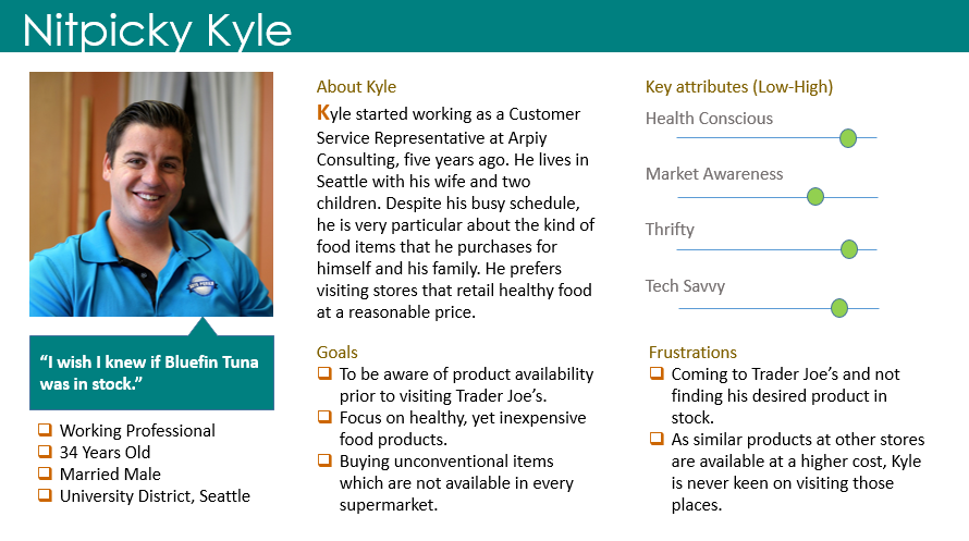
User Persona
User Personas were defined to create a connection with various types of grocery-shoppers. For the initial step, we decided to go with the most common user type (based on our interviews and also after asking customer support representatives to validate our decision). The character was fictitious with its details emerging from real data obtained in the initial stages - identifying common goals, motivations, and frustrations of a regular customer at Trader Joe’s.
A working parent of one or two kids who comes to Trader Joes' specifically to find healthy and interesting food for his/ her kids turned out to be the most common user type.
A working parent of one or two kids who comes to Trader Joes' specifically to find healthy and interesting food for his/ her kids turned out to be the most common user type.
Further brainstorming the problem
Based on the research findings, where we got a good sense of who our users are, what are their problems and expectations, we conducted extensive brainstorming sessions to think about potential solutions. Each team member came up with their individual proposals and we discussed each of them in detail - weighing the pros and cons, analyzing the feasibility and relevance of each. We also tried to understand which of the possible outcomes would be the most usable, desirable and efficient.
Some of the ideas - in-store kiosks, monthly newsletters by Trader Joe's, smart phone app(s), Facebook ads
With smart phones being more pervasive than they ever were, we decided to design for an iPhone mobile application that helps the customers of Trader Joe's find the items of interest before going to the store.
Design requirements and app considerations
- Provide item details/ description in a comprehensive and concise manner.
- Provide users with a quick, 1-click access to new offers by the store.
- Enable users to search for product availability in 2 clicks.
- Provide users with the options to set notifications about product availability, on and off instantly.
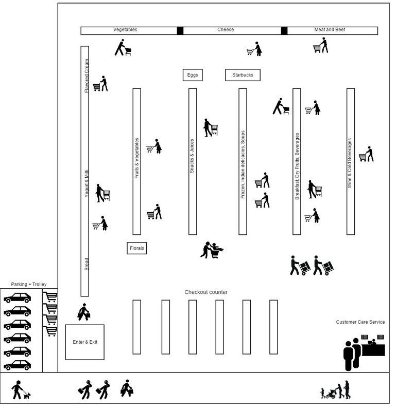
Contextual Modelling - Physical Model
When building a new product, it always helps to understand the environment in which the product will be used or where does its impact lie. In the physical model below, I attempted to depict the details of the physical setting of the Trader Joe’s at University District, Seattle. Owing to the size, location and number of people visiting the store, we can see how difficult it must be for the customers of Trader Joe's to find what they are looking for, without having any prior knowledge of where they might find it.
The idea to create a physical model and analyze it stems from the fact that quite a few interviewees complained about the orientation of the store (including the car parking area).
The idea to create a physical model and analyze it stems from the fact that quite a few interviewees complained about the orientation of the store (including the car parking area).
The Strategy
Empathizing with users truly provides a deeper understanding of the problem to further identify user goals and create solutions that positively impact their experiences. User research and extensive brainstorming helped uncover some of the primary goals of the application -
- Notify/ inform about new and out-of-stock products
- Knowledge about available offers
- Navigation tips and updates
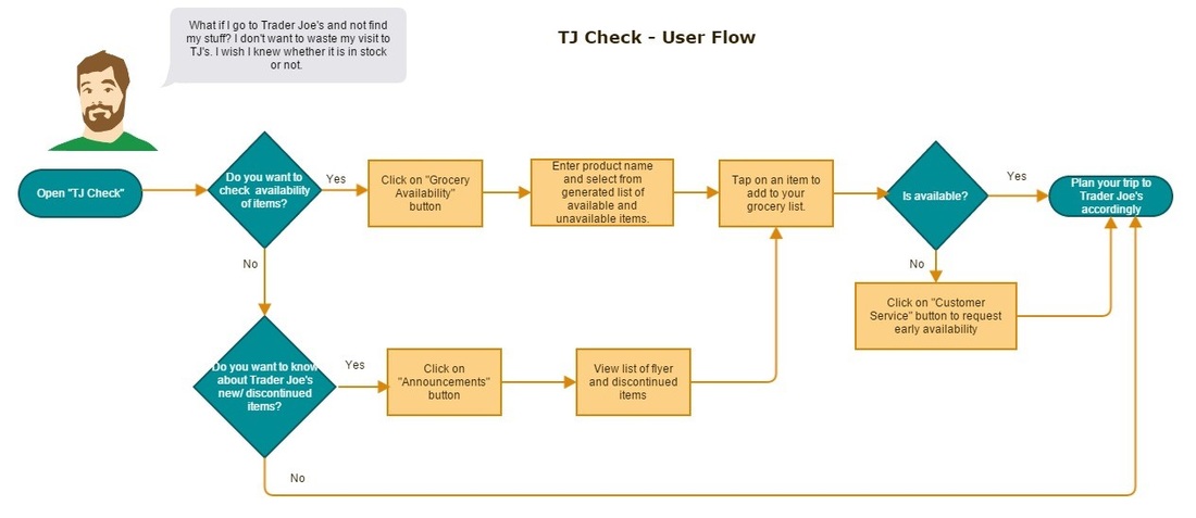
Initial User Flow
The design and ideation process started with a rough user flow that could be validated and revisited as we made progress. Adding a character to the user flow along with his real need from the application helped bring empathy to our design thinking process. Below is one of the versions of the user flow created -
Bringing ideas to sketches
Initial sketches focused on the main screens that helped users perform some of the primary functions like (a) creating a grocery list and checking for availability of items, (b) learning about what's new in a particular store, (c) getting recommendations based on past purchases.
For the time being, we decided to hold off on the navigation idea as it required integration of in-store maps of the aisles, parking, accessibility routes and trolley sections. Something to map for in the future.
The sketched were further refined based on feedback from friends (who were also Trader Joe's customers), each time making the flow easier and simpler. In the latest iterations, new and minute features were added to make the user goals more deeply embedded in the user flow.
Early iteration
Later iteration
Envisioning Cards (An additional design tool to empathize with more user types)
We considered the following envisioning cards (design tool) and incorporated features accordingly in our prototypes:
- We have incorporated a voice inquiry-voice response functionality in our application which will enable users with limited or no vision and users with limited motor controls, to use our application to their benefit.
- We have built a feature in our application, which either detects the location of the user using GPS technology or enables the user to select their location. Using location data, the application loads the inventory of the nearest TJ’s.
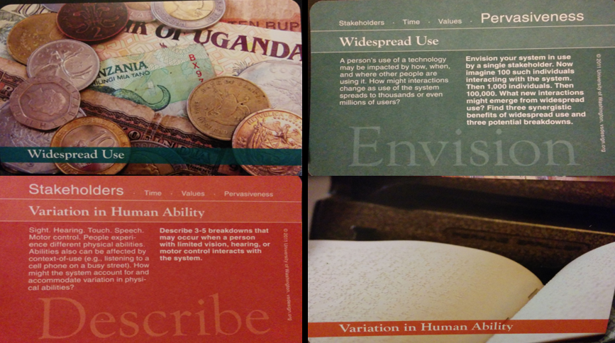
Learn more about Envisioning Cards - https://www.envisioningcards.com/
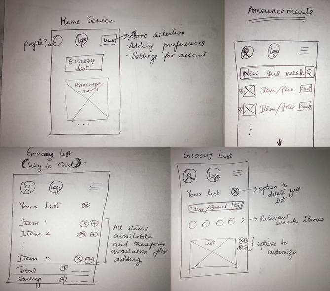
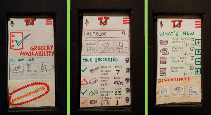
Low Fidelity Prototypes (Paper prototyping)
These prototype screens take into consideration: a) Showcasing prominence to the problem statement. b) Design influence based on two specific envisioning cards. Paper prototyping was chosen as this was still early stage and at this point, visual aesthetics weren't a top priority.
Usability testing was done next to get feedback on how well the app resonates with the users.
Usability testing was done next to get feedback on how well the app resonates with the users.
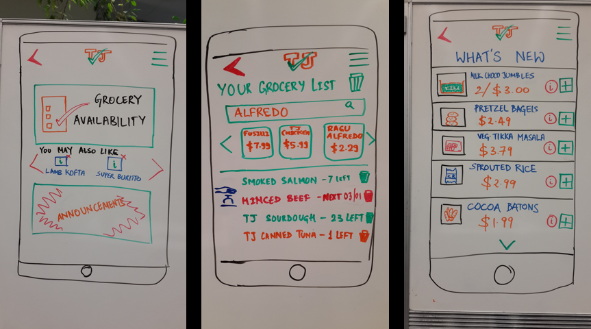
Validation - User Feedback Matters
I revisited the store in University District one more time to validate these designs with TJ customers. I moved the paper prototypes to my phone and made them interactive using Marvel so users could get a somewhat real and organic experience of using the app.
Participants were asked to perform the basic and primary tasks -
Participants were asked to perform the basic and primary tasks -
- You are at home, just thinking about driving out to run errands and planning for that special dinner this weekend. Open the TJ's app on your phone and show me how would you create a grocery list for yourself.
- You want to know if frozen veg. samosas are available or not. How would you do that?
- You remember you purchased a bottle of spicy wine from Californian vineyards 3 months ago. How would you find out if it is in stock today?
Are the results updated? - "All this is nice. But what happens when I add something to my list because it shows that 1 item is available and then I drive to the store to find that someone else bought it in the mean time?"
Some of the participants voiced their doubts about the relevance and newness of the availability results as items might be gone or out by the time they got to the store. This might depend on rush hours, user's promptness to arrive at the store after seeing availability etc.
Where are these recommendations coming from? - "I like getting ideas for my list, but I'd rather decide that for myself."
Looking at the importance given to recommended items, users pointed out that they'd want to see the announcements more promptly visible. Recommendations (drawing parallels with Amazon.com) are secondary and sometimes not viewed by most users.
Abundance of information - "Is there a way to change the view so I don't see these pictures if I don't want to. There's just a lot happening here."
When asked to look at the screen with their grocery list compiled on it, most participants said it was too much information. While everything was important and good to know, each line item had too much information to take in and also made the page look overwhelming.
Continuous Improvement
Feedback from users revealed some interesting issues that didn't seem obvious to us as its creators. I revisited some of the top findings (as shown above) and processed them to refine the prototypes.
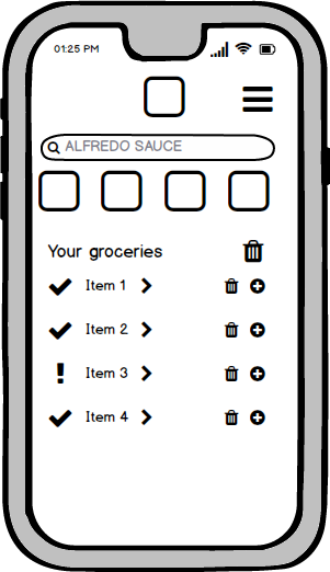
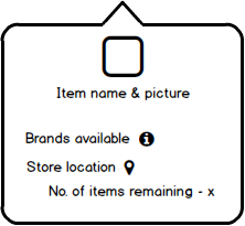
I changed the grocery list page to make it simpler, yet to be able to perform all the tasks as required. Instead of creating a new page for each item - which would be massive development overload and too much wastage of memory - I decided to provide the necessary information in the form of a pop-up or modal that will pop over when the item name is clicked on.
Also I tried different ways of displaying announcements or notifications that could further be verified by users. The goal here was to make sure announcements received precedence and yet did not disturb the overall experience of using the app - like how advertisements do.
|
|
Reflection
As a Trader Joe's customer myself, I found this project to be very interesting and it also kept me motivated to keep going. While I have only solved for one of the issues as of now, my goal is to continue iterating on all the issues highlighted by the customers. I also want to be able to re-evaluate the designs with customers/ users to get ideas on next steps. One of the steps I have in mind is, in-app navigation facilities that change for each store.
Towards the end, I also got to informally speak with inventory managers at couple of grocery stores other than Trader Joe's who helped me understand the strategy behind managing inventory and how might that fit into the an app like TJ Check. While this is possible, it could be heavy on database management. However, the industry is shifting towards having an online presence and therefore, it is no more an option but a necessity. Another item on my list was to explore ideas on importing massive amounts of data on to the app.
"This is possible because Trader Joe's is a special store and has fewer number of stores in every city. Can a similar solution be applied to other bigger brands?" - Something to solve for in the future.
Acknowledgement
We thank the staff and management at Trader Joe’s for cooperating with us and allowing us to conduct our research without any hassles. We would also like to thank the customers of Trader Joe’s who were patient with us and gave us their time to enrich our study results. Finally, we wish to extend our gratitude to Professor Batya Friedman who gave us the opportunity to work on this project and provided us timely guidance on the design process.
